Improving Google Maps
This case study highlights my self-initiated project focused on redesigning Google Maps. While the app is well-established, I chose to concentrate on enhancing the restaurant exploration experience while aligning these improvements with business goals aiming to improve user engagement and retention among casual users.
Client
Self-initiated project
Year
2021
Role
UX Design, UI Design
Problem
Breaking down Google Maps
Google Maps is a widely used platform that serves multiple purposes, including (a) general mapping, (b) navigation, and (c) exploring points of interest such as restaurants, hotels, and attractions. While it excels as a navigation tool, its restaurant discovery experience falls short. Hence, for this case study, I focused on improving the "Points of Interest" feature. Through research, I found that many casual users switch to competitors like Yelp and TripAdvisor because Google Maps:
Overwhelms them with too much information but not enough guidance
Offers generic recommendations that don’t align with personal preferences
Provides a passive browsing experience, leading to drop-offs before a decision is made
By refining this feature, I aimed to create a more engaging and intuitive experience, encouraging users to stay within Google Maps rather than switching to alternatives, while also aligning with Google Maps’ broader goal of increasing user retention and interaction.


Documenting the user journey, pain points and impact during user research
Discover
Understanding Users' Needs
To define the core problem, I conducted user research and a competitive analysis to understand how users currently search for restaurants, why some prefer competitor platforms and what features keep users engaged. Casual users describe their typical process of discovering, booking, and reviewing restaurants using Google Maps and other apps. They often encounter issues that lead them to switch to alternative platforms like TheFork, Tripadvisor, Instagram, or FourSquare.
Clarifying the Core Problems
1️⃣ Inaccurate information on price, menu, and photos
Users rely on images to estimate prices and menu options, but many menus are missing or outdated.
Stock photos or low-quality images make it difficult to judge the food accurately.
Curent price filters ($, $$ or $$$) are too broad, requiring users to check restaurant websites for accurate pricing.
2️⃣ Overwhelmed by choice
Too many options without clear differentiation make decision-making difficult.
Users often rely on personal recommendations from friends and family instead.
Filtering features (e.g., dietary preferences) are inadequate or missing.
3️⃣ Inaccurate location results & dish reviews
Users aren’t sure if all restaurants in an area are displayed correctly.
Search results change unpredictably when restarting the app or zooming into an area.
Dish-specific reviews and recommendations are missing, making it hard to judge individual menu items.
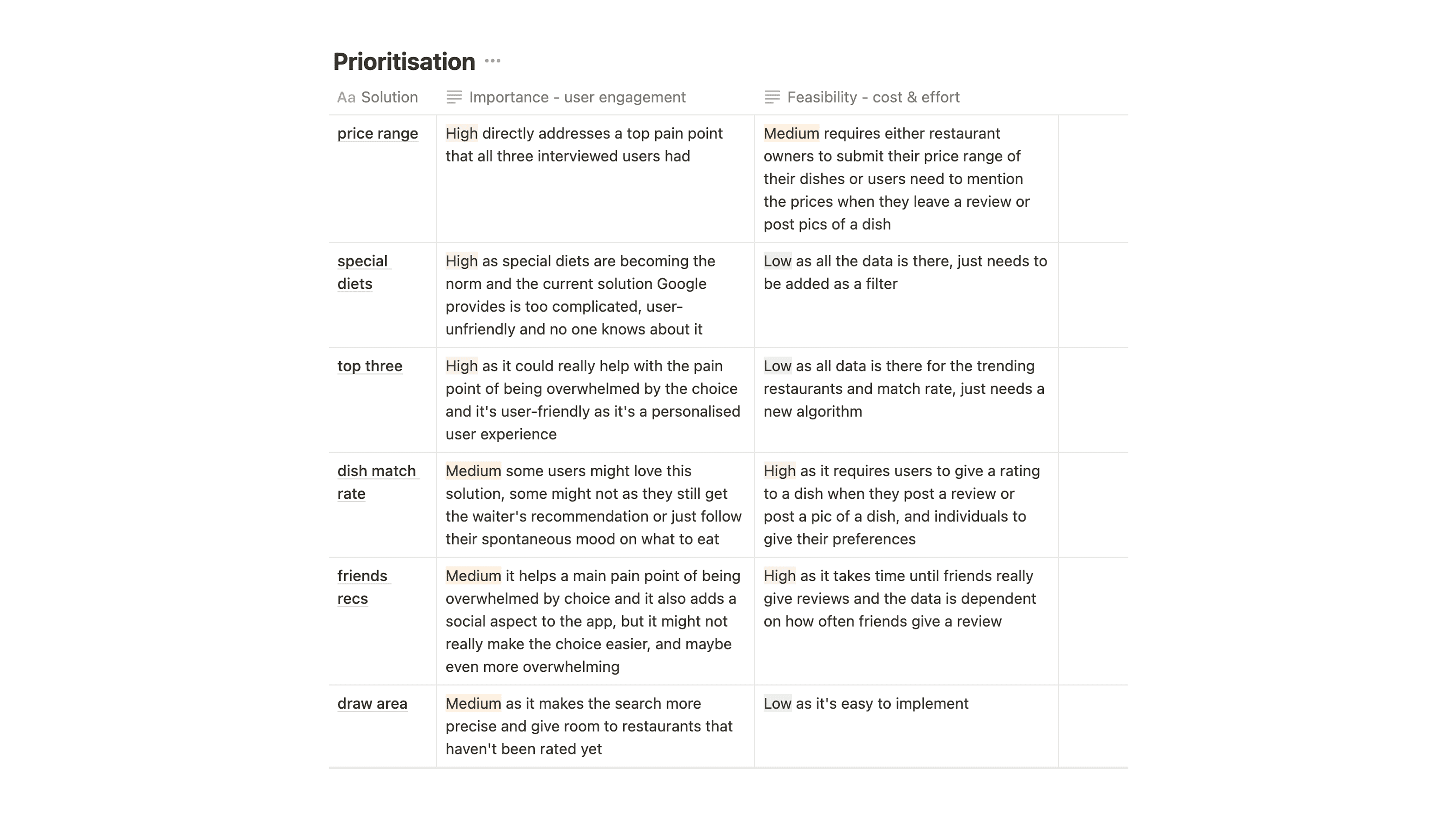
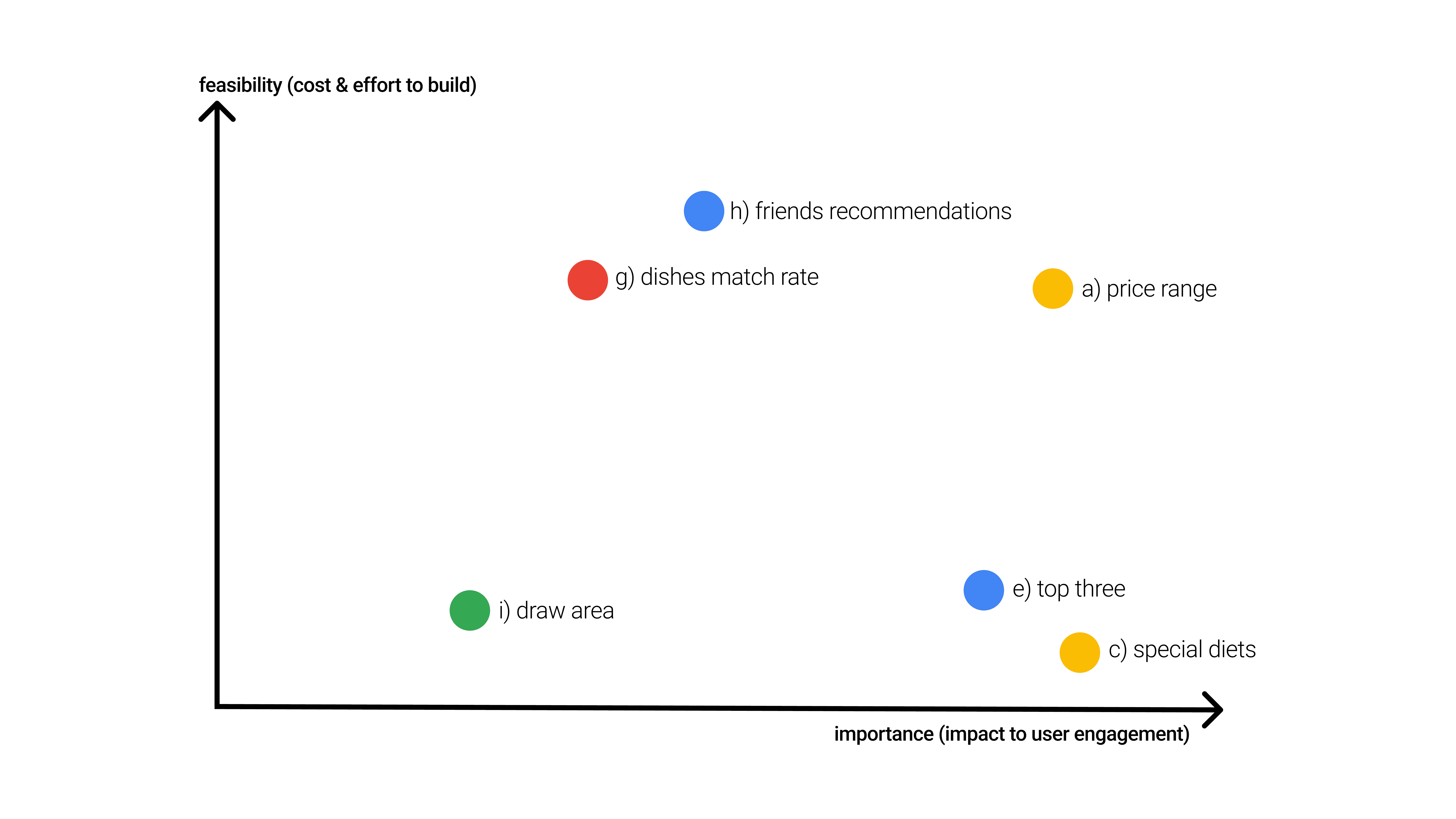
Prioritising possible solutions in terms of importance (user engagement) vs. feasibility (cost & effort)
Iterate
Generating Solutions
I brainstormed 10 potential improvements to solve these problems, considering feasibility and impact. Some ideas were removed due to business constraints (e.g., social media integration conflicting with Google's ad model) or complexity (e.g., requiring restaurants to upload full menus).
Prioritization Process
Using a prioritization matrix, I evaluated each idea based on (1) importance (impact on user engagement) and (2) feasibility (cost & effort to build).
The top three solutions chosen for further exploration were:
Price Range Filter – Directly addresses a major user pain point but requires structured data collection.
Dietary Filter – A simple but impactful improvement that enhances accessibility.
Top Three Recommendations – Reduces choice overload with personalized suggestions, leveraging existing data.
By balancing user needs and technical feasibility, these improvements provide high-impact, low-cost solutions that enhance Google Maps' restaurant discovery experience.
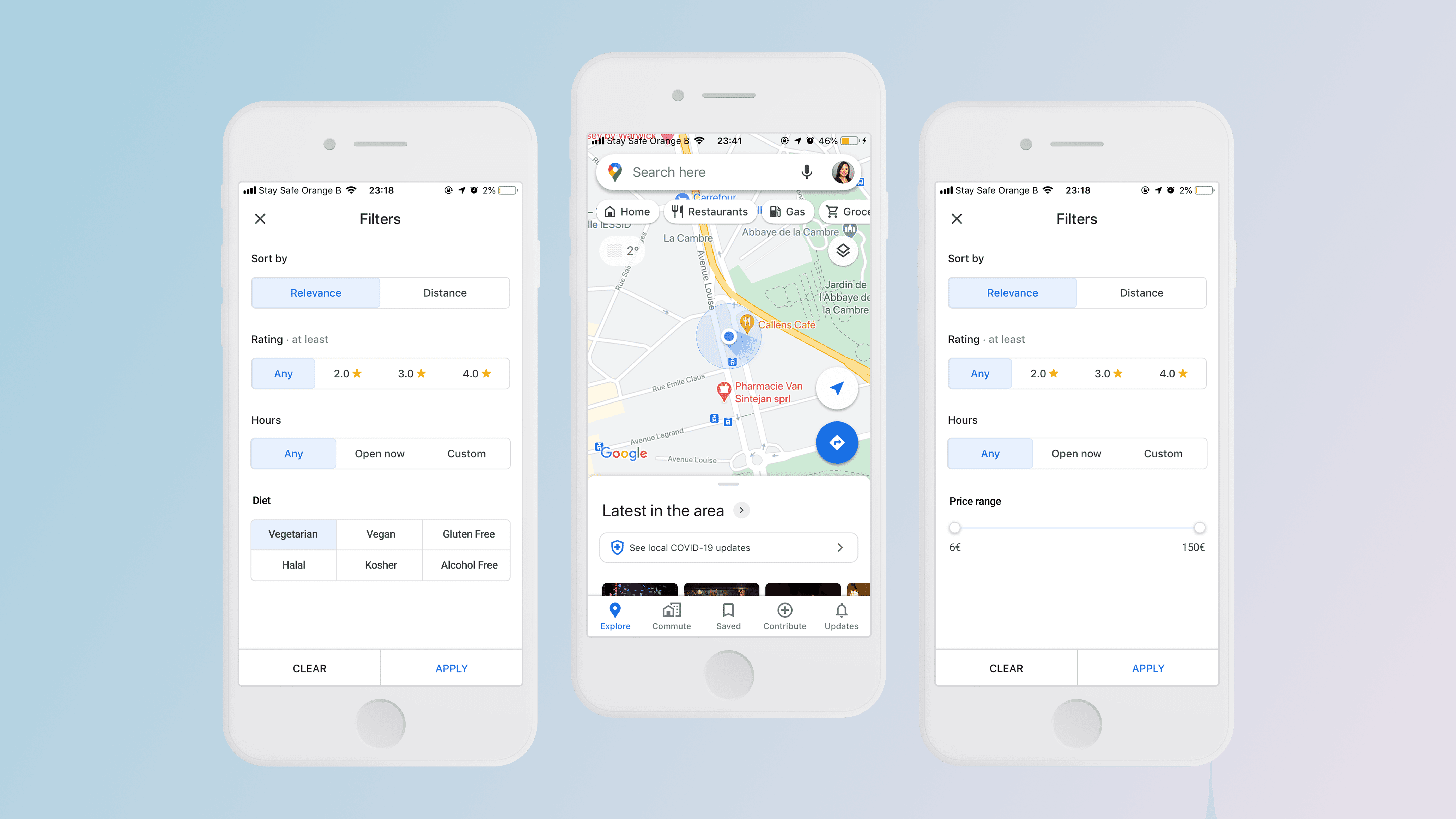
Solution
I designed a price range slider, a multi-select dietary filter, and a "Your Top Three" recommendation feature based on user behavior.


Price range slider

"Your top three" recommendation based on user behaviour
Outcome
Next Steps
If I were to work at Google, I would measure the the success of the improvements post-launch. Here's what I'd look at:
number of active user per day/week/month: to see if there's an increase of users
total number of restaurant searches per month: to see if the new features make the users search for restaurants more often
the median number of restaurant searches per active user per month: same as above but more precise on users; 2. could also be due to other factors
bounce rate: to see if the users are dropping out of their session more or less than before
number of user actions per session: which actions a user makes and which features they use
These KPIs are showing if the improvements are driving user engagement. User engagement is measured by regular searches.
Google Did Launch This Feature
I worked on this self-initiated project in January 2021 and in July 2021, Google Maps has released a feature where users could leave more detailed restaurant reviews including selecting how much their meal cost per person with a $10 price range increments (Source: Search Engine Land). Later the same year in December, Google Maps announced plans to display price ranges for US restaurants and introduce a price slider (Source: Search Engine Land).