Redesign of DataViz system
In this project case study, I will be sharing one of my experiences working as a founding product designer and developing a sustainability reporting software for an ESG start-up.
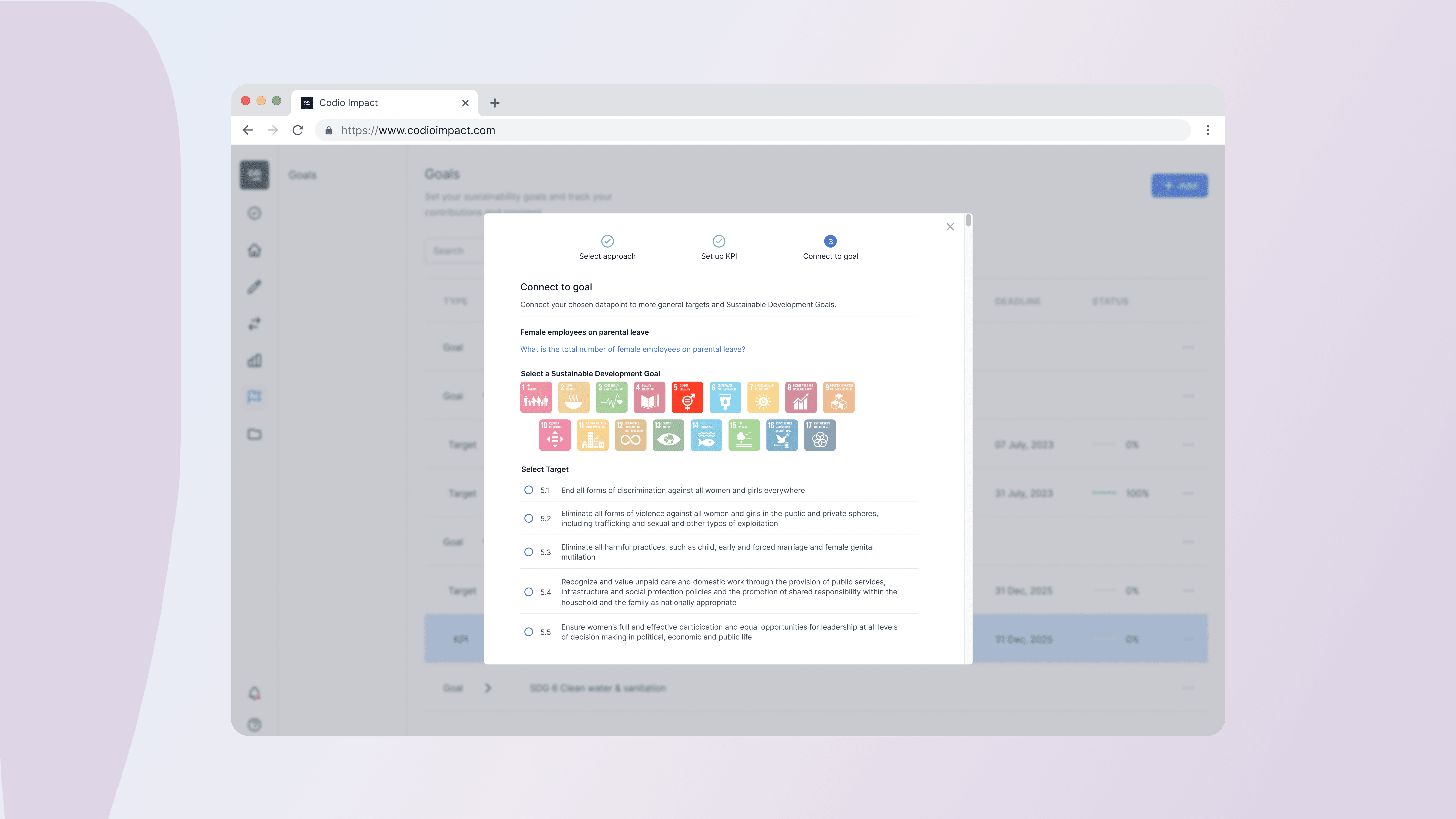
The goal was to create an web app that automates the processing of sustainability questionnaires and ESG ratings for enterprises. Here I am redesigning the data visualisation for the all the answers to the questionnaires and the data that is being collected by the users.
Client
Codio Impact
Year
2022
Role
UX Design, UI Design, Design Systems

Problem
Collecting data is at the centre of our solution's value proposition. Our current DataViz system did not reflect this.
The old data visualisation only used line charts and was not scalable to include all relevant data so that users could make informed decisions. Administrators needed better tools to filter and compare data and casual users had difficulties understanding complex sustainability data.

Discover
Understand User's Needs
I interviewed 3 users of our current customers. They consistently reported issues with adding a chart to their dashboard. The current user flow was to click on a 'star' button to favourite the data point, which was difficult to see. Many also mentioned that they didn't know how to remove a chart and that it was difficult for them to read the data. This was also confirmed by customer support tickets.
Competitor Analysis and Market Research
I looked at competitor products and realised that the DataViz systems offered simpler, more streamlined user flows with clear visual feedback. This helped us to reduce the number of steps and ensure a better user experience.
Clarifying the Core Problem
Unclear and not visible buttons confused and frustrated users and caused them to leave the site.
Lack of basic features such as filters or chart selection gave users the feeling that this data was not useful.
Inflexible dashboard made it difficult for administrators to compare data and prevented them from using it for reports.
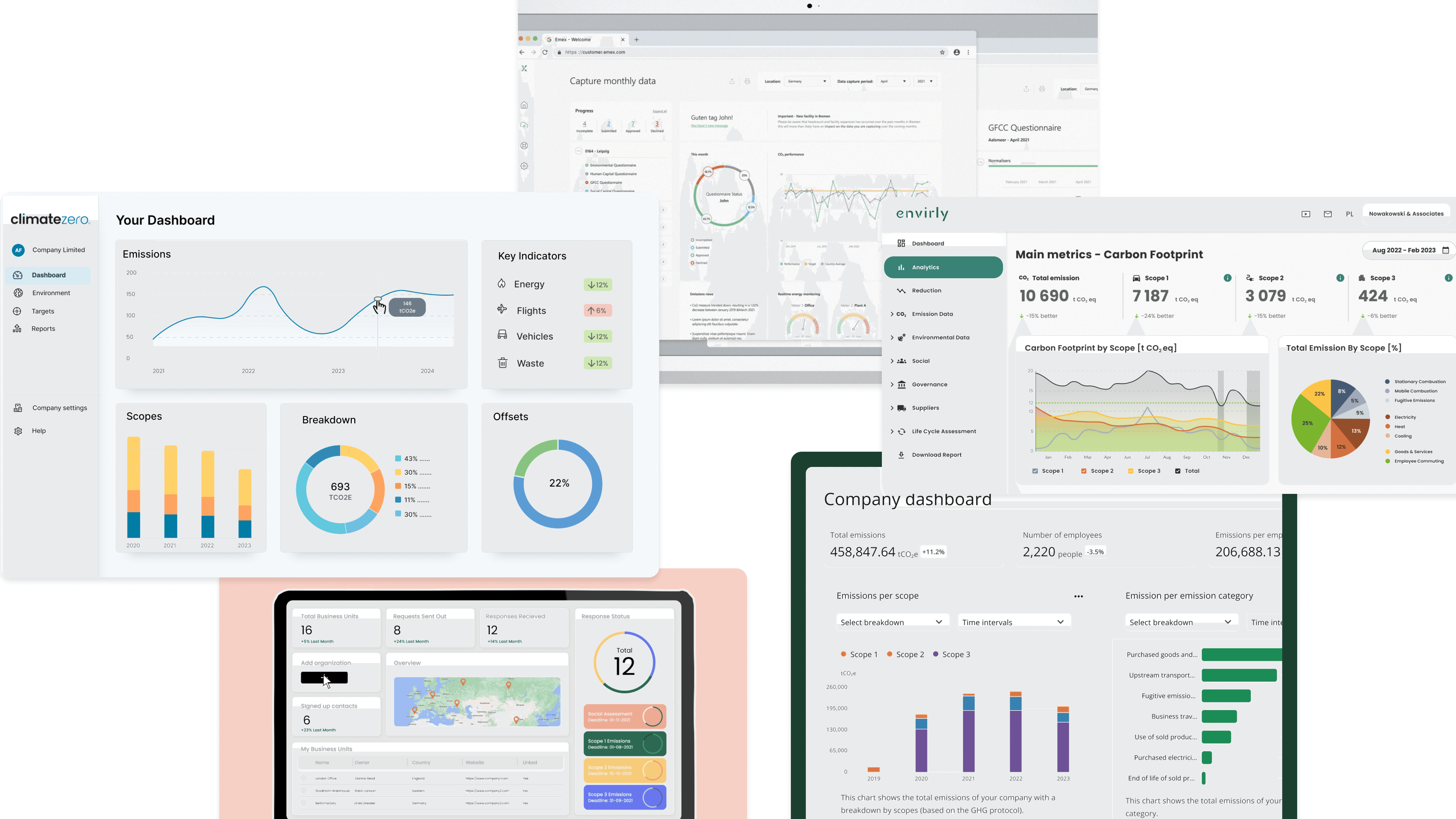
Competitor Analysis
Iterate
Wireframing and Flow Mapping
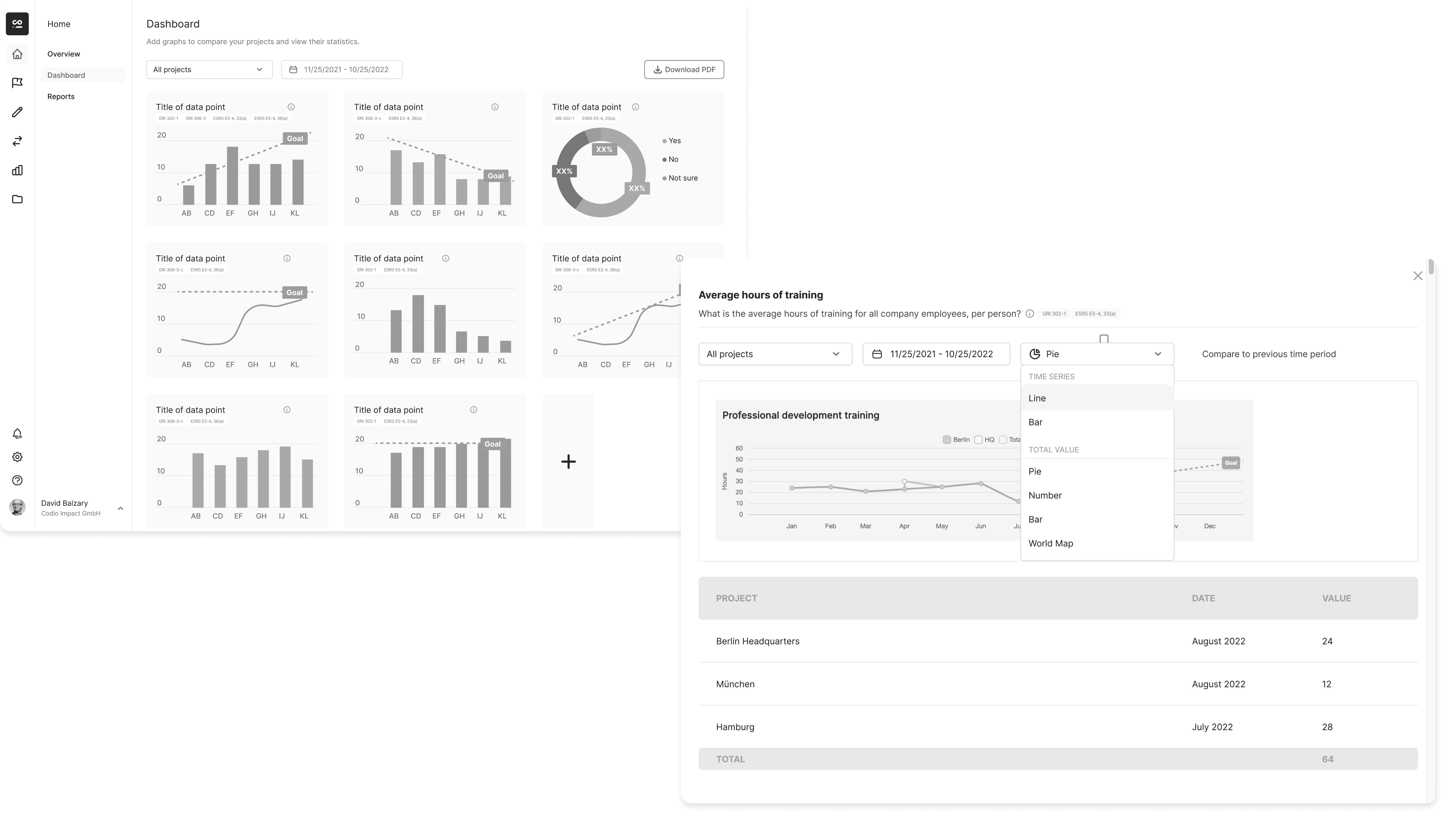
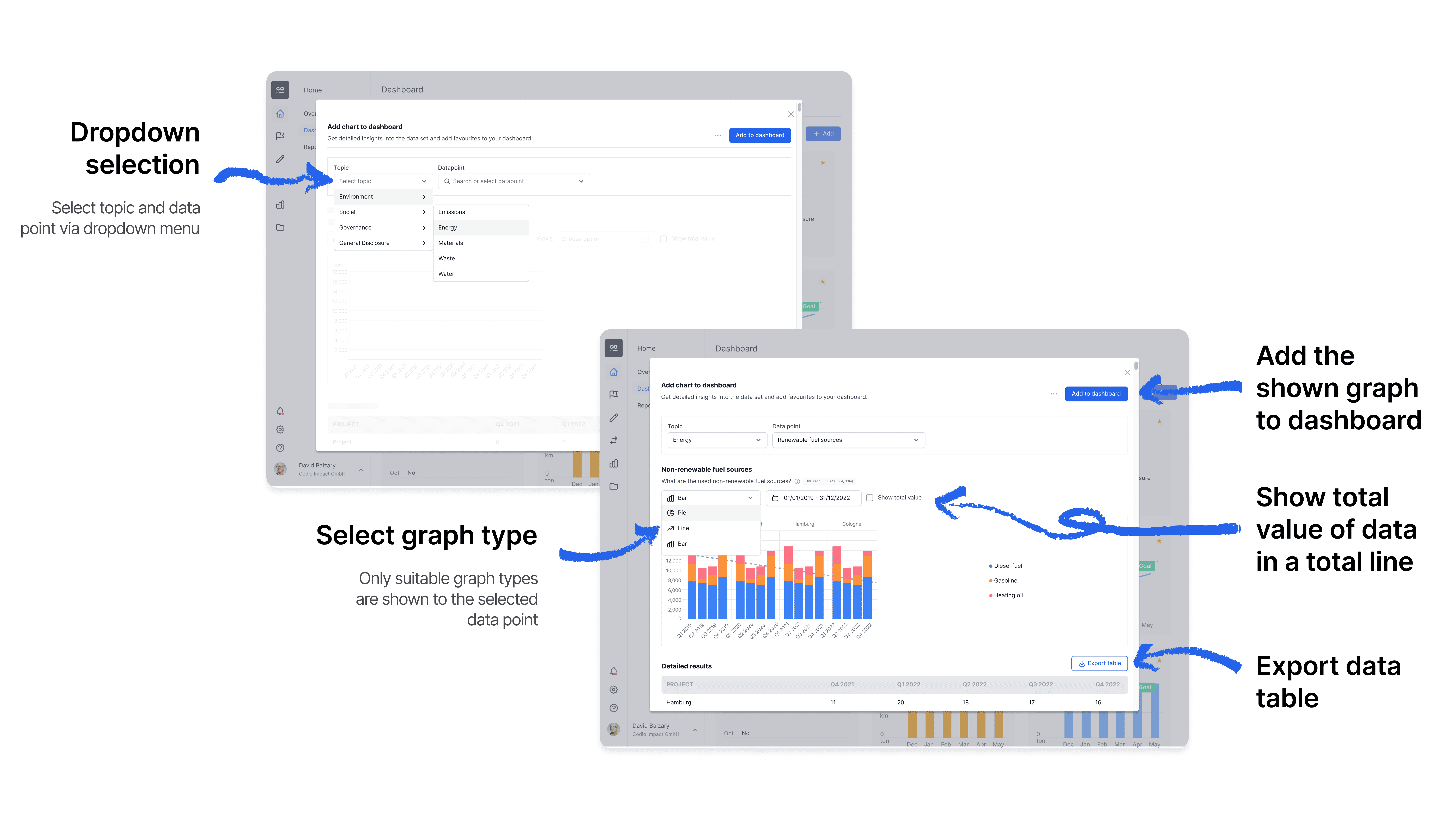
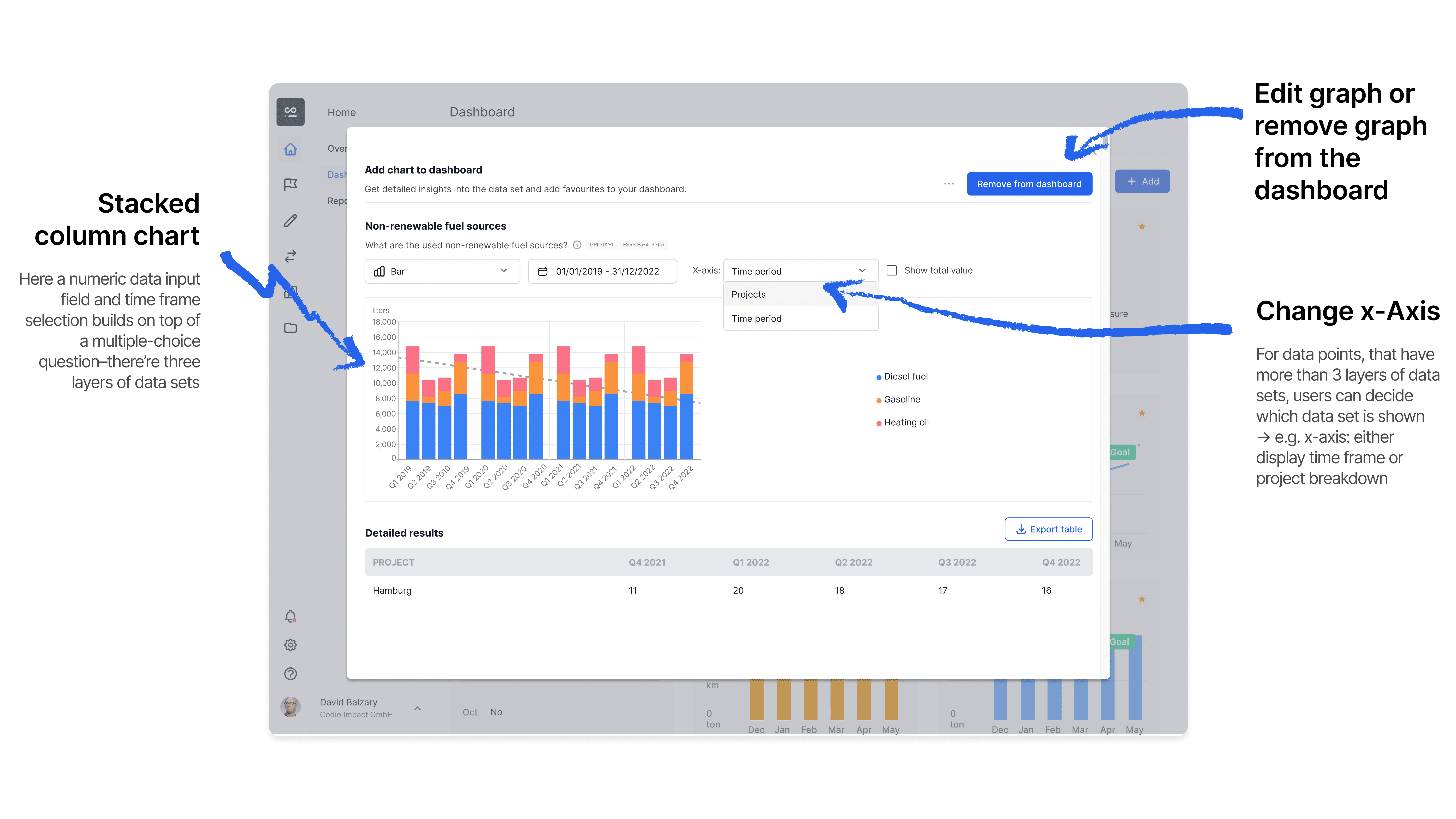
Based on my user interviews, competitor analyses and market research, I developed the first wireframes and flow maps. I analysed all the data sets in our platform and defined the appropriate chart type for each data type (e.g. pie chart, bar chart, line chart, stacked bar chart). The biggest challenge was that the data came from a complex, linked questionnaire system in which multiple-choice and yes/no questions built on each other and had to be linked to the respective sustainability goals.
Solution
We developed clearer, user-friendly chart designs, interactive filters for customised views and an improved admin interface for faster data access and more efficient use.


Outcome
Challenges
Data visualisations had to be both understandable and regulatory correct.
Positive Feedback
Simplicity of diagram selection and customisation of the dashboard for users.
Next Steps
Conduct tests primarily with compliance teams.